RPL Provider Design System
A training provider’s site had to read as a credible education provider and still sell hard to people comparing providers side by side.
Designed with Pixxibird, our sister design studio
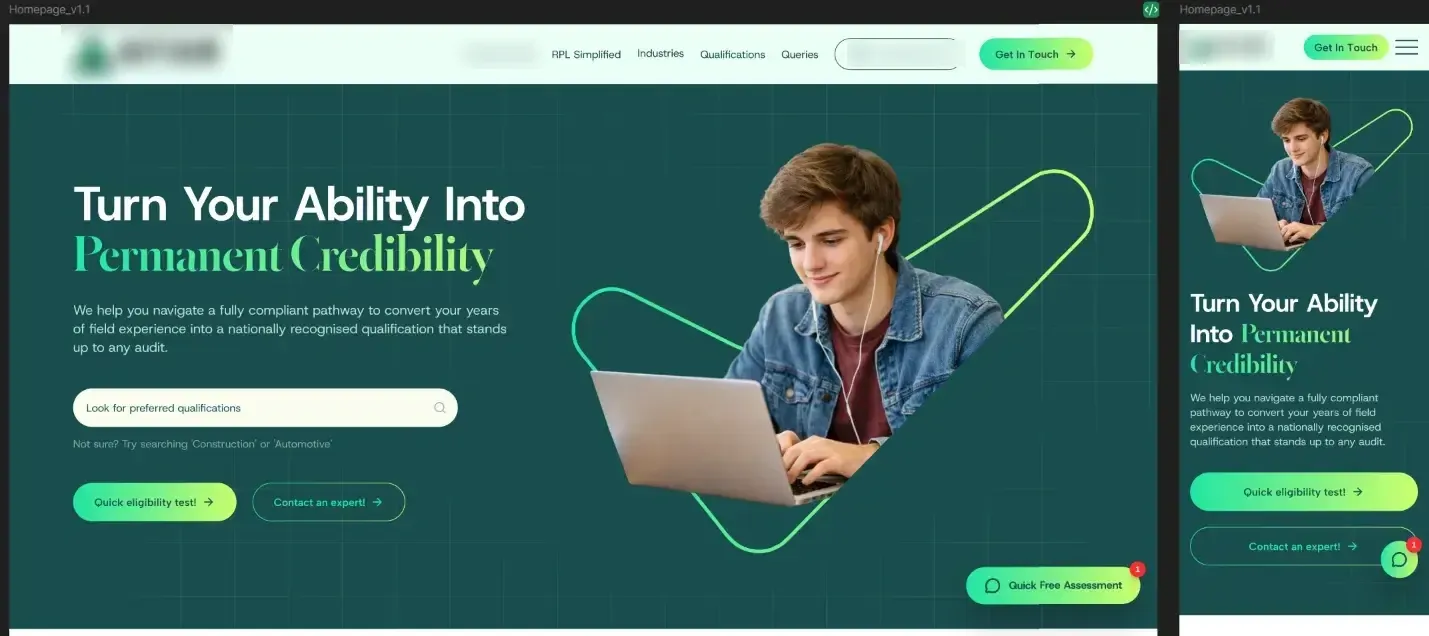
The home page design, desktop and mobile
Problem
An Australian training provider needed a website that reads as a credible education provider to people weighing years of their own experience, and still sells hard to visitors comparing several providers side by side.
Approach
The design system came before the pages. Type is a grotesk for headings and body with a serif accent, set on a full type scale for desktop and for mobile. Colour, spacing and the component set are documented alongside it, and an implementation guide maps each design token to the build, so developers never have to guess a value from a screenshot.
The pages were then drawn from those parts: the qualification catalogue, the eligibility flow and the campaign landing pages all use the same components doing the same jobs.
Result
The website design and its documented system, handed to development and implemented in the live site.
Stack
UI/UX and web design in Figma, with a design-system document and an implementation guide for the build team. Designed by Pixxibird, our sister design studio, on a Nodevex contract; the build is the RPL Provider Website case.