Claroox Campaign Dashboard
Media buyers live in filters. Claroox had the data and no hierarchy to read it by: everything arrived at once, at the same weight.
Designed with Pixxibird, our sister design studio
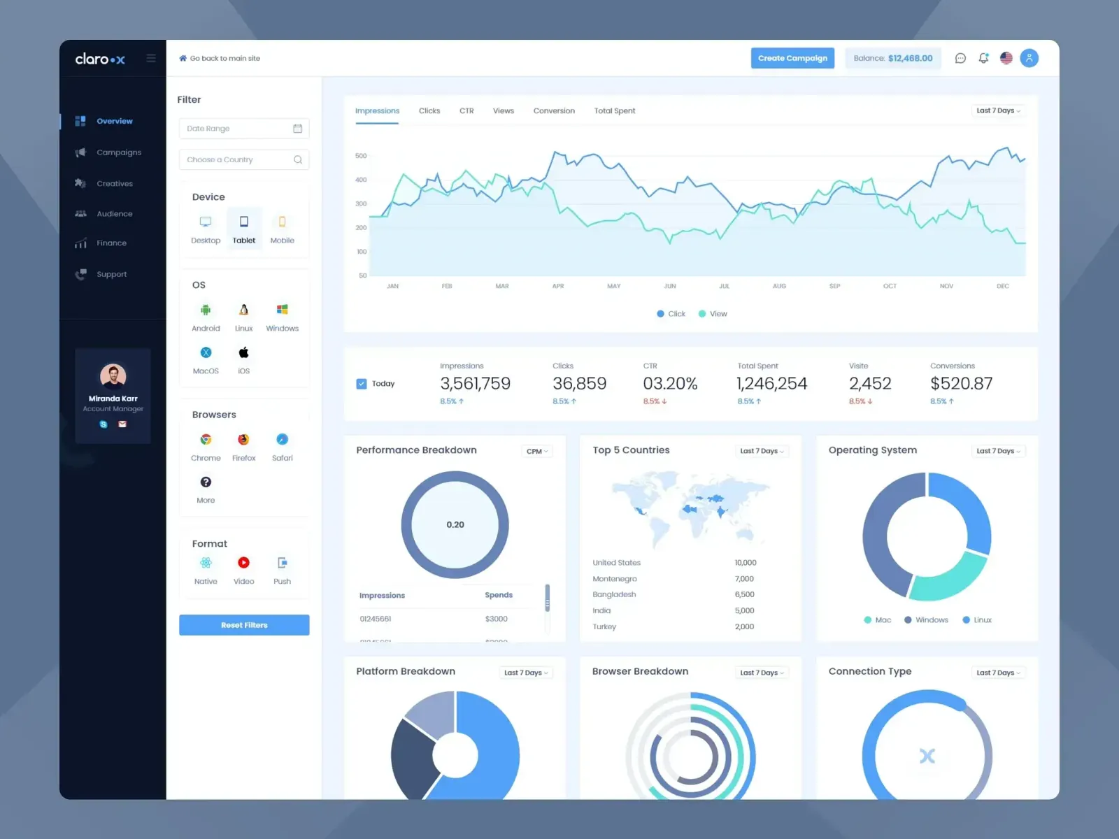
The campaign overview: filter rail, impressions over time, and the day's numbers in one row
Problem
Media buyers live in filters. Claroox had the data — impressions, clicks, CTR, spend and conversions, split by device, operating system, browser and format — and no hierarchy to read it by. Everything arrived at once, at the same weight.
Approach
A persistent filter rail on the left, one impressions-over-time chart at the top, then the day's six numbers in a single row with their direction of travel. The breakdowns became small multiples below the fold instead of competing for the top of the screen.
Result
The operating surfaces a buyer moves between every day — overview, campaigns, creatives, audience, finance and support — and the two flows that spend money, creative upload and add funds, with the same components doing the same jobs in both.
Stack
Product design, information architecture and a design system that the build team works from, so the dashboard's components behave the same wherever they appear.